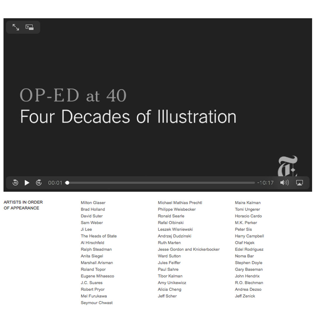
New York Times Op-Ed Chart :: Typically, graphic commentary illustrations for the New York Times Op-Ed pages demand nimble thinking and swift execution, as the deadlines can be as tight as a few hours. ⏳ A notable exception to the hurried turn-around was “The State of Iraq” Op-Chart—a combination opinion article and chart—an early infographic that was updated and ran quarterly in the Times for several years. Due to the frequency of this piece, it was (amazingly) included in the NY Times’ special anniversary feature video “Op-Ed at 40” appearing alongside the work of some of my own true illustration and design heroes. It also affirmed my love for creating information graphics. 📋✍🏼💕